The KPI designer is comprised of five main steps to configure the logic. The KPI module in formulate acts like a wizard to step the use through this building process.
- KPI formulations can be scripted in PQL or MDX.
- Actual, Target and Status values are all based on 'formula' building described in detail here.
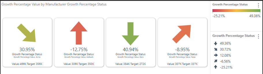
Example
In the example below, the Reverse Signs style is selected and then added to a Gauge visual:
Creating a KPI
Building KPIs involves the following key steps:
- Setting the KPI's default graphic style.
- Setting the logic for the KPI's Actual Value.
- Setting the logic for the KPI's Target Value.
- Setting the logic for the KPI's Status Value. This logic indicates how the Actual Value compares to the Target Value.
- Setting the logic for the KPI's Bands. The Bands allow you to indicate how the KPI status aligns with some benchmarks.
Step 1: KPI Style / Graphic
This first step sets the KPI's default graphic style. Select the required graphical indicator Style for the KPI. When the KPI is visualized in Discover, the chosen KPI style will be used in the visual as the default Status Indicator. These indicators can be used to visualize the KPI status in Matrix Grids and Gauges.
Note: End users can change the default graphical representation using the conditional formatting tools.
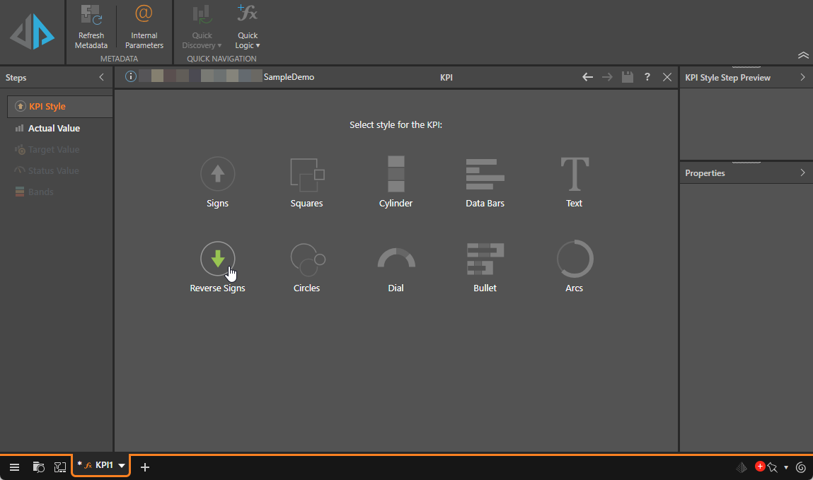
Style Limitations
Most styles can be used as a status indicator in both Matrix Grid and Gauge visualizations. However, the Dial and Bullet graphic styles behave differently to the other KPI styles.
Dials
Dials are designed specifically for use in the gauge visual; if a Dial indicator is added to a grid, the Text indicator will be rendered instead of the Dial.
Bullets
Likewise, the Bullet style is designed for use with the Bullet chart. While it does not produce a status indicator, it updates the drop zones to remove the indicator zone, which is not required for the bullet chart.
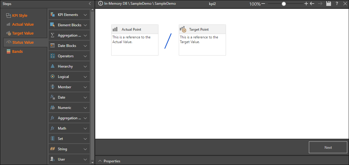
Step 2: KPI Actual Value
In this step, you set the logic for the KPI's Actual Value. This value represents the level of ACTUAL performance.
In the Steps panel (left), select the Actual Value tab and, with the Data Point selected on the canvas, add the required blocks and functions in order to write the Actual Value expression.
Element, Aggregation, and Date blocks (purple highlight below) must be injected with the required model metadata from the properties panel (blue highlight).
- Actual values are designed using the same framework as normal formulas, described in detail here.
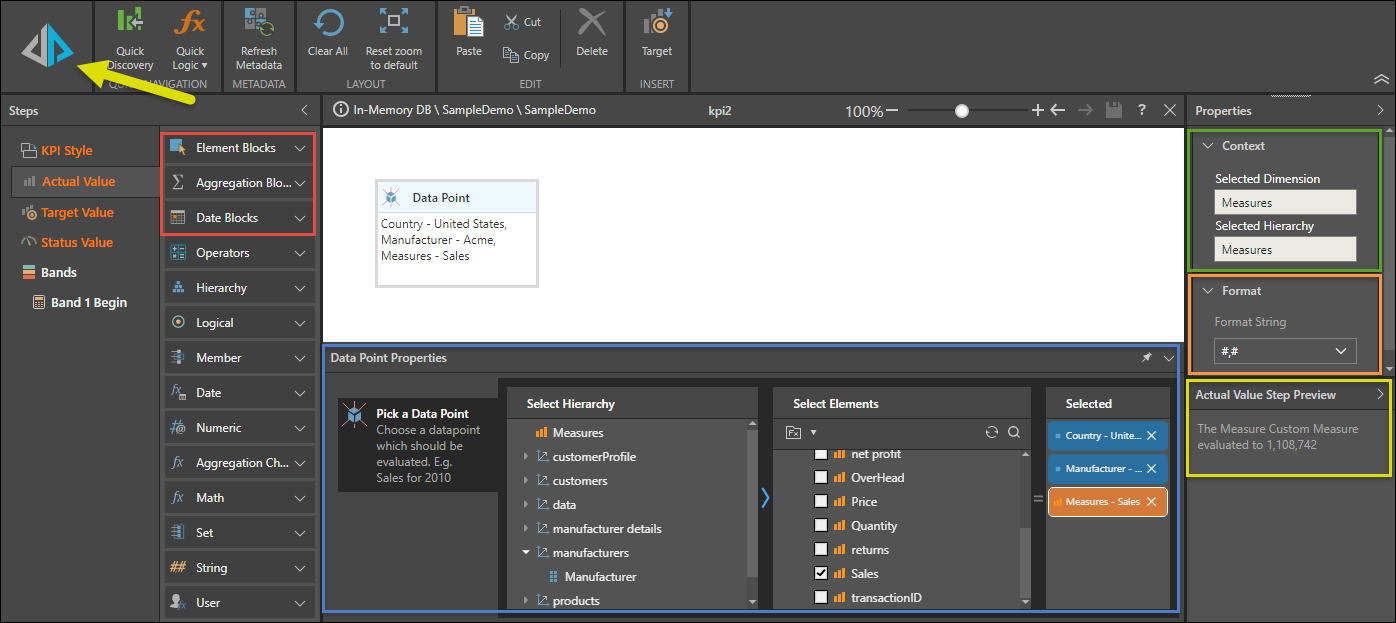
Context Panel
The context panel (green highlight above) displays the Save location for the KPI. Each KPI must have a designated parent dimension and hierarchy (in the Properties panel). Building a KPI creates custom measures, and as such, they are automatically saved in the Measures dimension and hierarchy.
Format Panel
The value's format string may be changed in the Format panel (orange highlight). Users can apply a format string to each custom measure within the KPI, to determine how metrics for the custom measure are formatted. Format string options include a variety of preset options; such as currency, percentage, and standard number masks like #,#.
Step Preview Panel
Users can test KPIs at any step in the KPI builder, by clicking the Run button (yellow arrow). When you run your KPI, the Step Preview panel (yellow highlight) displays a preview of the current result.
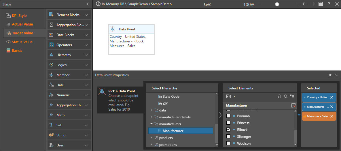
Step 3: KPI Target Value
This step sets the logic for the KPI's target value. The target value is the intended GOAL or TARGET of performance against which the actual outcome is measured.
Select the Target Value tab and set up the data point as in the previous step. The capabilities (available blocks and panels) are identical to the Actual value page described above.
Tip: You can use the Copy Actual Fx button in the overhead ribbon to copy the Data Point block from the Actual Value to the Target Value.
- Target values are designed using the same framework as normal formulas, described in detail here.
Step 4: KPI Status Value
This step sets the logic for the KPI's status value. Status describes how the Actual Value compares to the Target Value.
Select the Status Value tab and either create a Status Value formula on the canvas or choose a preset formula from the Templates dropdown list in the KPI ribbon. The formula that you configure is used to generate the status value. The capabilities (available blocks and panels) are identical to the Actual value page described above, with the addition of the KPI elements section. You can add additional Actual Point and Target Point blocks to your formula from KPI elements.
- Status values are designed using the same framework as normal formulas, described in detail here.
Templates
Select a preset option from the Templates dropdown list to indicate how you want to calculate the Status Value:
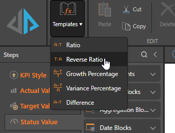
- Ratio: Actual / Target
- Reverse Ratio: Target / Actual
- Growth Percentage: Actual - Target / Target
- Variance Percentage: Actual - Target / Actual
- Difference: Actual - Target
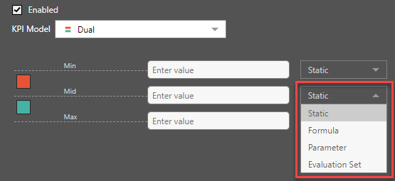
Step 5: KPI Bands
Bands are used to give the end user a sense of the status value of the outcome. Usually, a status value may show as red, if its value is poor, or green if it is doing well. Designers can generate 2,3,4 or 5 bands using static values or advanced formulas so that the bands dynamically resolve intelligently.
To begin, define the ranges (bands) for the KPI. Start by enabling bands:
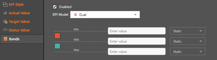
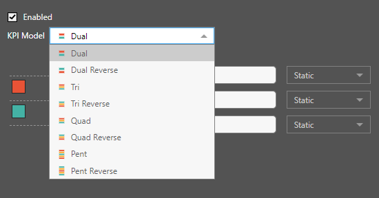
Next, choose the KPI model; the model selected determines the number of bands. The following options are available:
Next, insert static or dynamic values into each band; the band ranges affect the KPI color display. You may select a static value, a formula, parameter, or evaluation set. Using the more advanced band options allows for dynamic banding for KPI values - which produces a more efficient and more intelligent solution.
- Click here for more information about KPI dynamic banding.
Band Colors
By default, Band colors are NOT defined in the KPI designer tools; they are derived from the Theme used by the discovery or presentation. Alternatively, you can edit the colors of the bands using the Conditional Formatting dialog box.